Özel İstek : Çerçeve Gruplamaları
.

.
A beloved reader/blogger requested some inspiration for a frame grouping she's planning to do on her living room wall. She especially wanted to see the combination of different styles of frames. So, voila!
.
Bugünkü post konumuz çok Mügemmell. Sevgili Müge bugüne kadar topladığı ilüstrasyon vb. güzel materyalleri duvarda bir çerçeve gruplaması yaparak sergilemeyi planladığını, ne tarzda çerçeveleri bir arada kullanacağına karar vermesine yardımcı olması için biraz ilhama ihtiyaç duyduğunu belirtti. Tabii ki kırmıyoruz kendisini.
.

.
This is as mixed up as it gets. I think it looks wonderful even though the artwork isn't really spectacular..
Buradaki çerçeveler her telden çalıyor. Sergilenen resimleri tek tek beğenmesem de görüntünün bütünü çok güzel.
.

.
I love frame shelves. Saves you from the hassle of drilling a dozen holes. However frames placed on the floor like that goes against my principle of Vacuumability! .
Çerçeve rafı fikrini seviyorum. İnsanı duvara bir düzine delik delme derdinden kurtarıyor. Ancak bu şekilde yere konmuş çerçeveler Süpürülebilirlik ilkesine ters!.

.
Again, a seemingly random mix of styles. Still lookin' good.
.
Rastgele görünen bir karışım daha.
.

.
You can't do wrong with simple black frames. Just make sure they are painted matte, and to leave white space between the picture and the frame for a clean, modern look..
Sade siyah çerçevelerle hata yapmak imkansız. Çerçevelerin mat boyanmış olmasına ve resim ile çerçeve arasında beyaz paspartu kullanmaya dikkat etmeniz yeterli.
.

.

.
White with relief. I think these kind of frames look best in either very simple and pure rooms, or shabby chic ones. .
Beyaz, kabartmalı. Bence bunlar en çok ya saf, sade odalara, ya da eski püskü görünümlü feminen odalara yakışıyor.
.

.
Plain, white. Can't go wrong.
.
Düz, beyaz. Ters gidecek hiçbirşey yok.
.
.
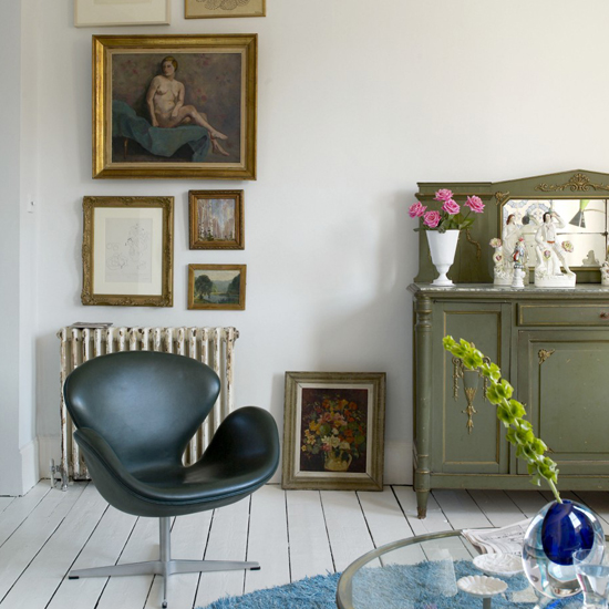
Gold looks wonderful with white floorboards. However I think the picture/painting inside must be strong enough not to disappear this kind of frame..
Altın rengi çerçeveler beyaz yerler ile harika duruyor. Yalnız bence bu tip bir çerçeve ile kullanılacak resmin biraz kuvvetli olması gerek, yoksa o altın varaklar yer yutar o resmi.
.

.
Mixture of plain frames. I love it when the frame is too big for the picture.
.
Sadelerden karışık. Çerçevenin resme göre aşırı büyük olmasını seviyorum.
.

.
I do not care for the stuffed toys, but I'm quite taken by the animal illustrations. Especially the unfinished illustration of a .
Peluş oyuncakları görmemiş olayım ama hayvan ilüstrasyonlarını, özellikle de bitmemiş ayıyı (edit: ayı değil ayı sansarıymış) çok sevdim. Ayrıca resimleri konuya göre gruplamak hoş bir fikir. .

.
This wall belongs to Mia of the wonderful blog Trendey. Love'em all; the artwork, the color of the velvet, the Union Jack cushion, and the Ikea PS by Front lamp..
Bu duvar Trendey adlı blog'un yazarlarından Mia'ya ait. Resimlere, kadifenin rengine, Union Jack yastığa, Front tasarımı Ikea PS lambaya, hepsine bayıldım..

.
Erin Wasson's eclectic wall! Frames, no frames.
I hope this helps!
I hope this helps!
.
Erin Wasson'a ait eklektik duvar. Çerçeveli, çerçevesiz. Ortaya karışık.
Umarım faydası olmuştur.
Umarım faydası olmuştur.
.
1-2-3 Per Gunnarsson, 4-5 Ditte Isager, 6 Sköna Hem, 7 Yatzer via Emma's, 8 from here via Emma's, 9 Trine Thorsen via Trendey, 10 Sköna Hem via Emma's, 11 Pia Ulin via Trendey, 12 home of "Trendey" blogger Mia, 13 Erin Wasson's home from The Selby..
PS : What do you think about the facelift I gave the blog? I wanted it to be easier on the eye and with larger pictures. I hope you like it!.
Not: Blog'un yeni yüzü hakkında ne düşünüyorsunuz? Göz yormasın, resimler de daha büyük olsun istedim. Umarım beğenirsiniz!


