Showing posts with label oturma odası. Show all posts

Tuesday, March 22, 2011

Basic & Comfy

Sade & Rahat
{}
{}
Home Reno round 2 is going on in my home, and spring has failed to arrive. That means we are getting toxic fumes while our previously beige doors are being painted white, and we can't open a window without freezing. Looking at so many pretty pictures on blogs makes you think it's easy doesn't it? But even though I have a long way to go before it's "complete", I'm already liking the feeling of being home.
{}
I love Muuto's "Rest" sofa by Anderssen & Voll. It doesn't look stiff like many other modern looking sofas. My sofa is very different but the picture has the exact look I'm aiming for:  basic and comfy. (Let's hope I achieve it!)
{}
Tadilat round 2 evimde devam ededursun, bahar bir türlü gelemedi. Bu da kapılar bej'den beyaza boyanırken çıkan toksik kokulardan kurtulmak için cam açamadığımız anlamına geliyor. Bloglarda güzel resimlere bakmak insanı bu işin çok da zor olmadığı yanılgısına düşürüyor. Herşeyin "tamam" olmasına daha uzun bir yolum var ama şimdiden evde olmak bana mutluluk verir oldu.
{}
Yukardaki resimde görülen Muuto'nun "Rest" kanepesini beğeniyorum, çoğu modern kanepenin aksine pofidik görünüyor. Benim kendi kanepem çok farklı ama resim hedeflediğim görünümü iyi yansıtıyor: sade ve rahat. 
{}
 {}
I came across these pictures above and below at two different places. Aren't the layouts nearly identical? It almost looks like it's one of those "one room, two looks" kind of features. Even the sofas made from pallets with wheels are similar. I like the large clock and animal pillows above, the wall lamp and the extended pallet used for stacking magazines below.
{}
Üstteki ve alttaki resimlere iki farklı yerde rastladım. Yerleşimleri neredeyse aynı değil mi? "Bir oda, iki görünüm" tarzı bir yazı için çekilmişler adeta. Tekerlekli paletten yapılma divanlar bile aynı. Üstte büyük saat ve hayvanlı yastıkları, altta duvar lambası ve paletin dergi koymak için uzun bırakılmasını sevdim.
{}
{}
Images 1, Muuto via Casa Papaioannou, 2 via In My House, 3 Seesaw.

Sunday, January 9, 2011

Life Inside a Snow Globe

Bir Kar Küresinin İçinde Yaşam
{}
{}
{}
Christmas won't be come for a whole year, but winter is still here! Embrace the coziness! These photos are by Pia Ulin...judging from the objects; for Ikea. I think I have finally become one of those Ikea enthusiasts who can list all their products by their Swedish names by heart. Still no gift basket whatsoever :)
{}
Noel, yılbaşı bir sene daha gelmeyecek, ama kış hala burada! Ya da bizim durumumuzda ha gayret, geldi gelecek. Battaniye, sahlep, kırmızı üçlüsünü bağrınıza basın. Bu fotoğraflar Pia Ulin tarafından çekilmiş, dekorlardaki objelere bakılırsa Ikea için. Sanırım Ikea ürünlerini İsveççe isimleriyle ezbere sayabilecek kıvama geldim. Hala bir hediye sepeti falan yok :) Kanyon'a yeni şube açan Habitat ( tutkun olduğum diğer marka) gibi Ikea da bir etkinlik yapar da çağıra çağıra moda bloggerlarını çağırırsa işte o zaman bozulurum. Bu ülkede tasarıma zaten değer verilmiyor, dekorasyon zannediliyor, bari dekorasyona değer verilsin değil mi ama?}

Sunday, November 14, 2010

Reader Request : Frame Groupings

Özel İstek : Çerçeve Gruplamaları
.
.
 A beloved reader/blogger requested some inspiration for a frame grouping she's planning to do on her living room wall. She especially wanted to see the combination of different styles of frames. So, voila!
.
Bugünkü post konumuz çok Mügemmell. Sevgili Müge bugüne kadar topladığı ilüstrasyon vb. güzel materyalleri duvarda bir çerçeve gruplaması yaparak sergilemeyi planladığını, ne tarzda çerçeveleri bir arada kullanacağına karar vermesine yardımcı olması için biraz ilhama ihtiyaç duyduğunu belirtti. Tabii ki kırmıyoruz kendisini.
.
.
This is as mixed up as it gets. I think it looks wonderful even though the artwork isn't really spectacular.
.
Buradaki çerçeveler her telden çalıyor. Sergilenen resimleri tek tek beğenmesem de görüntünün bütünü çok güzel.
.
 .
I love frame shelves. Saves you from the hassle of drilling a dozen holes. However frames placed on the floor like that goes against my principle of Vacuumability!
.
Çerçeve rafı fikrini seviyorum. İnsanı duvara bir düzine delik delme derdinden kurtarıyor. Ancak bu şekilde yere konmuş çerçeveler Süpürülebilirlik ilkesine ters!
.
.
Again, a seemingly random mix of styles. Still lookin' good.
.
Rastgele görünen bir karışım daha.
.
.
You can't do wrong with simple black frames. Just make sure they are painted matte, and to leave white space between the picture and the frame for a clean, modern look.
.
Sade siyah çerçevelerle hata yapmak imkansız. Çerçevelerin mat boyanmış olmasına ve resim ile çerçeve arasında beyaz paspartu kullanmaya dikkat etmeniz yeterli.
.
.
.
White with relief. I think these kind of frames look best in either very simple and pure rooms, or shabby chic ones.
.
Beyaz, kabartmalı. Bence bunlar en çok ya saf, sade odalara, ya da eski püskü görünümlü feminen odalara yakışıyor.
.
.
Plain, white. Can't go wrong.
.
Düz, beyaz. Ters gidecek hiçbirşey yok.
.
.
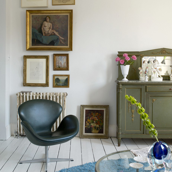
Gold looks wonderful with white floorboards. However I think the picture/painting inside must be strong enough not to disappear this kind of frame.
.
Altın rengi çerçeveler beyaz yerler ile harika duruyor. Yalnız bence bu tip bir çerçeve ile kullanılacak resmin biraz kuvvetli olması gerek, yoksa o altın varaklar yer yutar o resmi.
.
 .
Mixture of plain frames. I love it when the frame is too big for the picture.
.
Sadelerden karışık. Çerçevenin resme göre aşırı büyük olmasını seviyorum.
.
.
 I do not care for the stuffed toys, but I'm quite taken by the animal illustrations. Especially the unfinished illustration of a bear wolverine. I also like the idea of grouping pictures by subject.
.
Peluş oyuncakları görmemiş olayım ama hayvan ilüstrasyonlarını, özellikle de bitmemiş ayıyı (edit: ayı değil ayı sansarıymış) çok sevdim. Ayrıca resimleri konuya göre gruplamak hoş bir fikir. 
.
.
This wall belongs to Mia of the wonderful blog Trendey. Love'em all; the artwork, the color of the velvet, the Union Jack cushion, and the Ikea PS by Front lamp.
.
Bu duvar Trendey adlı blog'un yazarlarından Mia'ya ait. Resimlere, kadifenin rengine, Union Jack yastığa, Front tasarımı Ikea PS lambaya, hepsine bayıldım.
.
.
Erin Wasson's eclectic wall! Frames, no frames.
I hope this helps!
.
Erin Wasson'a ait eklektik duvar. Çerçeveli, çerçevesiz. Ortaya karışık.
Umarım faydası olmuştur.
.
1-2-3 Per Gunnarsson, 4-5 Ditte Isager, 6 Sköna Hem, 7 Yatzer via Emma's, 8 from here via Emma's, 9 Trine Thorsen via Trendey, 10 Sköna Hem via Emma's, 11 Pia Ulin via Trendey, 12 home of "Trendey" blogger Mia, 13 Erin Wasson's home from The Selby.
.
PS : What do you think about the facelift I gave the blog? I wanted it to be easier on the eye and with larger pictures. I hope you like it!
.
Not: Blog'un yeni yüzü hakkında ne düşünüyorsunuz? Göz yormasın, resimler de daha büyük olsun istedim. Umarım beğenirsiniz!

Monday, May 31, 2010

Pretend It's Stitched

Farzımahal İşleme
{}
{}
I have always loved cross stitches, although I will never have the patience to make one myself, I admire the texture and the appealing colors in stitched fabrics. Ikea has made a cross stitch print sofa, as you can see above. I really love the overall look of the room. The pattern of the sofa is adorable and the colors are very basic yet vibrant. By the way, stretched fabric (especially ugly ones) or plainly painted canvas displayed as art is my pet peeve but I'll let it slide just this once.
{}
As much as I like the picture above, today I had the chance to check out the sofa at my local Ikea and I'm a bit disappointed. A cross-stitch print this scale cannot fool me, it lacks the texture and warmth of the real thing. Sorry, Ikea, this one is a miss. I hope they make a cushion with this print that is actually embroidered. I'll be the first one in line to get it. Or alternatively I can wait (wait, and wait) til my mother embroiders one.
{}
Kanaviçeyi hep sevmişimdir. Kendim işleyecek sabrı hiç bir zaman bulamayacak olsam da işlemelerdeki doku ve çekici renkler hoşuma gidiyor. Ikea kanaviçe baskılı bir kanepe çıkarmış, yukardaki resimde görebileceğiniz üzere. Odanın genel görünümünü çok sevdim. Kanepenin deseni çok sevimli, renkler son derece basit ancak canlı. Bu arada gerilmiş kumaş (hele çirkin desenliyse) veya dümdüz boyanmış tuvallerin sanat eseri gibi sergilenmesi benim en sinirime dokunan şeylerden biridir ancak bu defalık göz yumacağım.
{}
Yukarıdaki resmi çok beğenmiş olmama karşın bugün mağazada bu kanepeyi bizzat gördüğümde hayal kırıklığına uğradım. Bu boyutlarda bir kanaviçe baskısı beni kandıramıyor, gerçek kanaviçe işlemenin dokusunu ve sıcaklığını yakalayamıyor. Üzgünüm Ikea, bu pek olmamış. Umarım bu desenin gerçekten işlenmiş versiyonuyla bir yastık filan yaparlar. Diğer alternatifim annemin işlemesini beklemek (beklemek, beklemek)...
{}
The "Stitch" lamp by LampGustaf however, is the real thing, and in my opinion, a hit. The color scheme they chose for the pattern is bold and beautiful, but you can always choose patterns and colors that would compliment your home. If you have the skills you can even apply the cute Ikea bird pattern on the lampshade.
{}
Lampgustaf'ın "Stitch" lambası ise Ikea kanepenin aksine, olmuş. Desen için seçtikleri renkler baskın ve güzel, ancak kendi evinize uyacak şekilde farklı seçimler de yapabilirsiniz. Hatta Ikea kanepeye yakışmayan desenin hakkını bu lambada verebilirsiniz.
{}
{}
{}

Friday, September 18, 2009

Soulmates

Ruh İkizleri
{}
{}
This shade of blue got me screaming like Samantha Jones. It's shape is almost identical to my favorite sofa, and it's in my current favorite color. When we recently went to buy a sofa for the new house, we wanted to get the Ikea Karlstad in Korndal Blue, as seen in this post of Hidden in France. Our current sofa, armchair and footstool are all off-white, almost identical to the ones in the above picture. We meant to combine those with the new blue sofa but unfortunately they didn't have it anymore. We got another color and don't regret it, it is SO comfortable.
{}
Mavinin bu tonu bana Samantha Jones gibi çığlıklar attırıyor. Mavi kanepenin biçimi benim favori kanepemle neredeyse aynı. Yeni eve kanepe almaya gittiğimizde Ikea'nın Karlstad modelinin Korndal Blue rengini almak istemiştik. Hidden in France'in bu yazısının sonunda görebilirsiniz. Mevcut koltuklarımız aynı resimdekilerin modelinde ve kırık beyaz. Onlarla mavi kanepeyi kombinleyecektik ama ellerinde kalmamıştı. Başka renk aldık mecburen ama inanılmaz rahat bir kanepe, tavsiye ederim.
{}


{}
My mom wants to put short, blue and white check curtains somewhere in the house... (Busted! Sorry mom, I guess I was only half-listening...) We have new wooden dining chairs for the kitchen and are on the hunt for cute cushions, and the style above is exactly what we had in mind, only we want patterned instead of solid. Maybe the owners of this house and us are decorating soulmates.
{}
Annem pencerelerden birine mavi-beyaz pötikareli kısa perde asmak istiyor (Yakalandım, yarım kulak dinliyormuşum sanırım çünkü nereye hatırlayamadım)... Ahşap mutfak sandalyelerine de aynı resimdekilerin modelinde minder arayışındayız, ama country tarzı bir desende. Galiba bu evin sahipleriyle dekorasyon ruh ikizleriyiz.
{}
{}
Well, the similarities end here, their house is huge. Anyone who reads this blog regularly knows my obsession with high wooden ceilings.
{}
Benzerlikler burada bitiyor. Onların evleri devasa! Bu blogu düzenli okuyan herkes yüksek ahşap tavanlara olan takıntımı bilir.
{}
{}
Oh, loving the old chest of drawers. I hereby proudly(or shamefully) announce that me and my mom picked up our first piece of reclaimed furniture (old, wooden, painted blue chair) from the garbage this month.
{}
Bu eski püskü şifonyere bayıldım. Bu vesileyle geçenlerde annemle birlikte ilk defa çöpten mobilya (eski, ahşap, mavi boyalı bir sandalye) aldığımızı itiraf edeyim. Neyseki iftar saatiydi, kimseler görmedi.
{}
{}
I'm so tempted to get a cat these days (but I realize I can't commit).
{}
Bu aralar bir yavru kediyi tutup eve getiresim var (ama sorumluluğu kaldıramayacağımın bilincindeyim).
{}
{}
Lovely display of fancy cookbooks. I'm not too much into cookbooks but I have my heart set on this one for both reading and as eye candy:
{}
Şık yemek kitaplarını sergilemek için iyi fikir. Yemek kitabı merakım yoktur ama hem okumak, hem de güzelliğine tav olduğum için şu kitabı çok istiyorum:
{}
{}
Miss Dahl's Voluptious Delights, by Sophie Dahl. I adored her grandfather, and I adore her. Be sure to watch the video where she talks about her book. I can't help but judge this book by it's cover and fall in love with it. A few pictures from inside the book:
{}
Roald Dahl'ın torunu , eskiden bir büyük beden manken olan güzel Sophie Dahl, yemekleri mevsimlere ve kahvaltılar, öğle yemekleri ve akşam yemeklerine ayırdığı, her tarifin arkasındaki hikayeyi anlattığı bir "yemek anı defteri" hazırlamış. Ömrü boyunca yemeyi sevmiş biri olarak kendi yemekle cebelleşmelerine de değinmiş. Tarifler hafif, basit ve lezzetli, tabii aralara gizlenmiş birkaç günahkar tarif de mevcut. Kitabın içindeki resimlerin muhteşem olduğunu söylüyorlar, şu alttaki resimler de bu söylemin doğruluğuna delalet:
{}
{}
{}
Thanks to everyone who still finds my blog readworthy after my many silent absences! Lazy blogger wishes you a great weekend!
{}
Tekrarlayan sessizliklerime rağmen blogumu okumaya değer bulanlara teşekkürler! Tembel blogger hepinize iyi haftasonları diler!
{}
First 6 images from Sköna Hem, the rest is from Amazon UK.
İlk 6 resim Sköna Hem, gerisi Amazon UK.

Tuesday, February 12, 2008

Color S.O.S.

Acil Renk Aranıyor
bosluk
My soul is in need of color! A very dark and dreary day, and my school project is due tomorrow (which is the reason of the lack of updates), so I can't even escape to the movies for a joy-refill. So I'm really feeling these strong colors today. At least I have my new fuchsia throw I got from Ikea to lighten me up a bit.
bosluk
Ruhum renk istiyor! Karanlık ve kasvetli bir gün, üstelik okul projemi yarın teslim etmem gerekiyor yani bu havadan sinemaya bile kaçamıyorum. O yüzden canım bugün capcanlı renkler çekiyor. En azından beni avutmak için geçen hafta son Ikea'dan aldığım fuşya kadife koltuk örtüm var.
bosluk
Image, Living Etc.
bosluk
Designer's Guild cushions have done a good job brightening up this charcoal dark room, so I'm sure they'll do wonders for my mood.
bosluk
Designer's Guild marka yastıklar bu gri, karanlık odayı renklendirmeyi başarmışlar, ruh halimi de aydınlatacak kadar güzeller. Koyu grinin üzerine canlı renkler, bir de kocaman aynalar çok yakışıyor.
bosluk
Image, Living Etc.
bosluk
I LOVE this berry colored sofa. And I love it in velvet. It looks so rich and stylish with the green lampshade and charcoal wall. Also, the cushions are really doing this beautiful berry baby justice; just the right amount of brightness.
bosluk
Bu koltuğun ahududu renginde olmasına BAYILDIM, kadife olmasına da. Yeşil lamba şapkası ve koyu gri duvarlarla çok zengin duruyor. Üzerindeki parlak yastıklar da hem rengi ortaya çıkarıyor, hm de aydınlık sağlıyor.
bosluk
Image, Living Etc.
bosluk
Louis-style chairs in cobalt blue vinyl? Why not? Great splash of color over white. That carpet and the vinyl are a very unexpected combination, yet it works great.
bosluk
Louis stili sandalyeler kobalt mavi vinil ile mi kaplanmış? Neden olmasın? Beyazın üzerinde harika bir renk patlaması olmuş. O halı ve mavi vinil beklenmedik bir kombinasyon, ama çok yakışmışlar.
bosluk

Image, Domino.
bosluk
How is such a fresh effect achieved by using so many bright colors together? I'm guessing it's because of the blank white walls and lots of light.
bosluk
Bu kadar çok canlı rengi bir arada kullanarak nasıl bu kadar ferah bir etki yakalamışlar? Bence boş beyaz duvarlar ve bol bol ışık sayesinde.
bosluk

bosluk
The pink velvet armchair looks so deliciously soft. I'm definitely going to get a major velvet fuchsia item for my home.
bosluk
Pembe kadife koltuk yumuşacık ve davetkar gözüküyor, üstelik Mudo Concept'ten. Evim için kesinlikle fuşya kadife birşeyler edinmeliyim, Ikea örtü yetmiyor...
bosluk

Image, Domino.
bosluk
I adore everything about this room, the space, walls, fireplace, mirror, sofa, and even the zebra rug. I'm normally not a great fan of zebra patterns but this one isn't as contrasting and black/white as usual. It's working great with the pink and white.
bosluk
Bu salonun herşeyini sevdim, boşluk hissi, duvarlar, şömine, ayna, hatta zebra halıyı bile. Normalde zebra desenini pek sevmem ama buradaki çok fazla siyah-beyaz bağırmıyor, üstelik pembe ve beyazlarla çok güzel uymuş. Halının koltuğun ahşap kısımlarıyla tam aynı tonda oluşuna dikkat.
bosluk

Image, Living Etc.
bosluk
Purple and yellow, two contrast colors in a neutral environment. I'm not sure if the armchair is velvet or not, but it would definitely look beautiful in velvet.
bosluk
Mor ve sarı, iki zıt renk, nötr renklerden oluşan bir paletin ortasında. Koltuk kadife mi bilmiyorum ama kadife olsa gerçekten hoş dururdu.
bosluk

Image, Living Etc.
bosluk
The mustard tones over chocolate walls. Once again Designer's Guild fabrics are responsible for this spectacular room.
bosluk
Çikolata duvarlar ve hardal tonları. Yine Designer's Guild marka kumaşlar bu odayı görkemli hale getiriyor.
bosluk

bosluk
More yellow, this time with black and white. A piece of the sun in your living room.
bosluk
Salonunuza güneş doğdu. Sapsarı kanepe siyah biyeleri ve beyaz ahşapları ile klasik tarzı üzerinden atmış ve çok özel bir parçaya dönüşmüş.
bosluk

bosluk
Colorful details: I love this pinky red chandelier. You can always count on a wall mirror to double the effect of a bold & beautiful chandelier. This works best in dining rooms.
boluk
Renkli detaylar: bu pembemsi kırmızı avizeyi çok beğendim. Böyle bir avizeyi yemek masanızın üzerine astığınızda, duvarınıza da aynı hizaya gelecek şekilde bir ayna asın. Bu sayede avizenizin etkisi iki katına çıkacak, duvarınızda ışıklı bir tablo elde edeceksiniz.
bosluk

bosluk
Turn a rusty chair into a piece of art by a lime plexyglass piece and some red ponpons and thread. Or just pass the chair and use a lime/red combo in details, such as a cushion, to brighten up your day.
bosluk
Paslı bir sandalyeyi, limon şekeri renginde bir pleksi-glas parça ve kendiniz yapabileceğiniz birkaç ponpon ve yün ipliklerle bir sanat eserine dönüştürün. Veya sandalyeyi boşverip bu cart sarı/kırmızı kombinasyonunu detaylarda kullanın; örneğin bir yastıkta.